strides for sarasota 5k logo design
Sarasota, FL | Nonprofit Fundraising Event | Logo Design, Typography & Collateral
View design process below:
In celebration of the Junior League of Sarasota’s inaugural 5K Walk & Run fundraiser, I had the opportunity to develop the official event logo — infusing energy, movement, and mission into a bold, colorful mark designed for maximum impact across promotions and merchandise.
From the very first sketch, the vision was clear: to craft a logo that evoked forward momentum, community action, and the heart of voluntarism. The final design draws from classic race-day visuals, with dynamic speed lines and a vibrant sneaker illustration featuring a heart-shaped tread, as a nod to the compassion and purpose behind the League’s work.
Design Process Highlights:
Concept Exploration
Initial pencil sketches presented to the JLS President explored a range of visual directions.
Inked Layout
The selected concept was refined into a bold, clean ink layout with a retro-leaning aesthetic, nodding to vintage race bibs and mid-century typography.
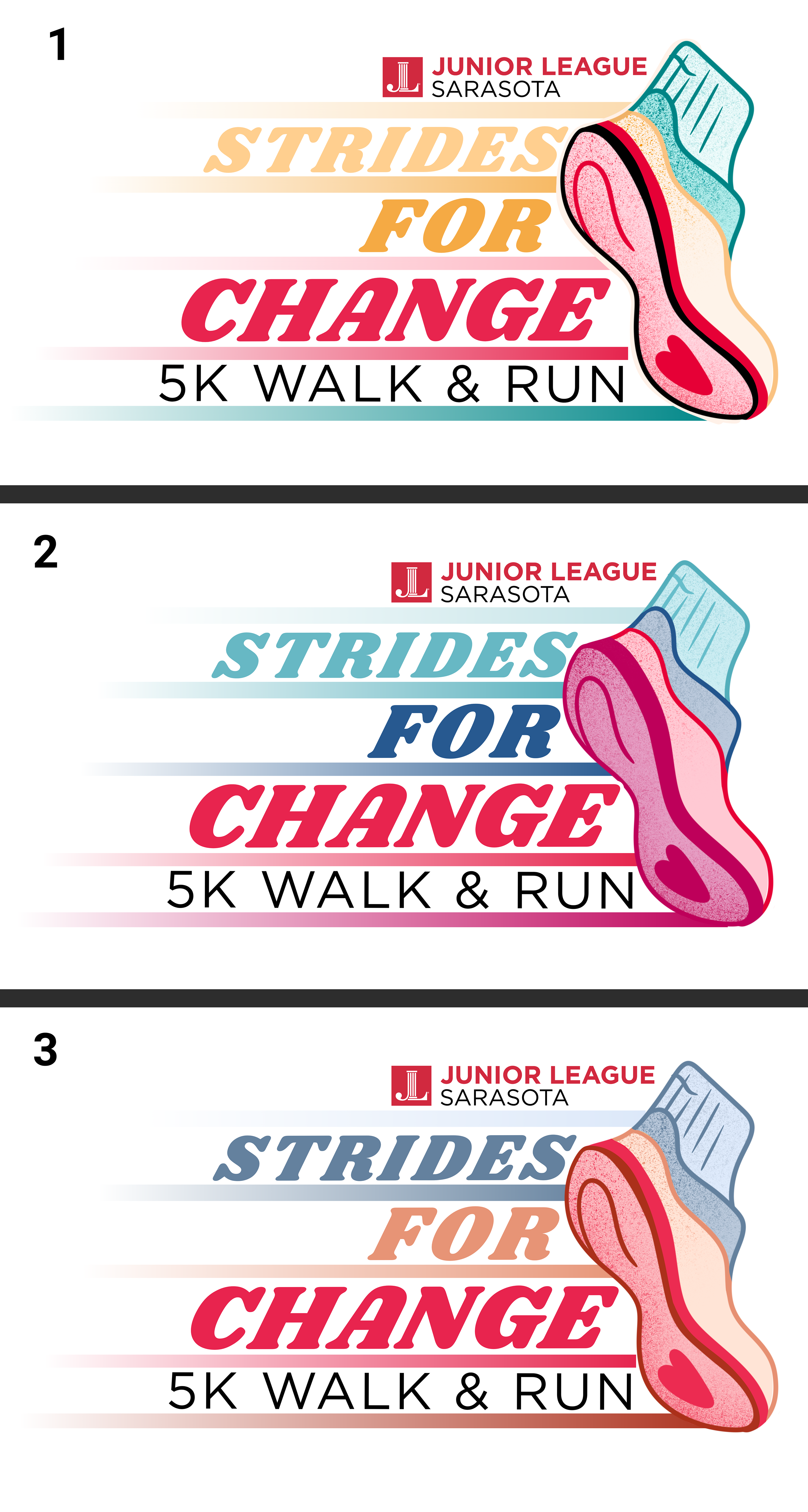
Color Theory
Three custom colorways were presented to JLS Board Members, each incorporating the League’s iconic red alongside complementary accent hues. The final palette blends Junior League red with coral, navy, and teal — colors chosen to reflect boldness, inclusivity, and energy.
This project reflects my passion for translating mission-driven themes into vibrant, scalable visual identities — balancing illustration, brand strategy, and symbolic storytelling to energize and unite a community.
-
![]()
Four logo concept sketches
-
![]()
Full ink sketch with typography
-
![]()
3 logo colorways incorporating JLS Red
-
![]()
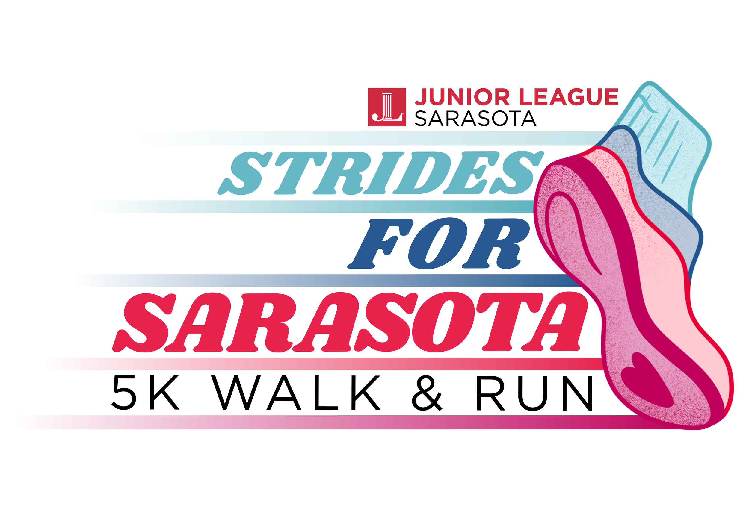
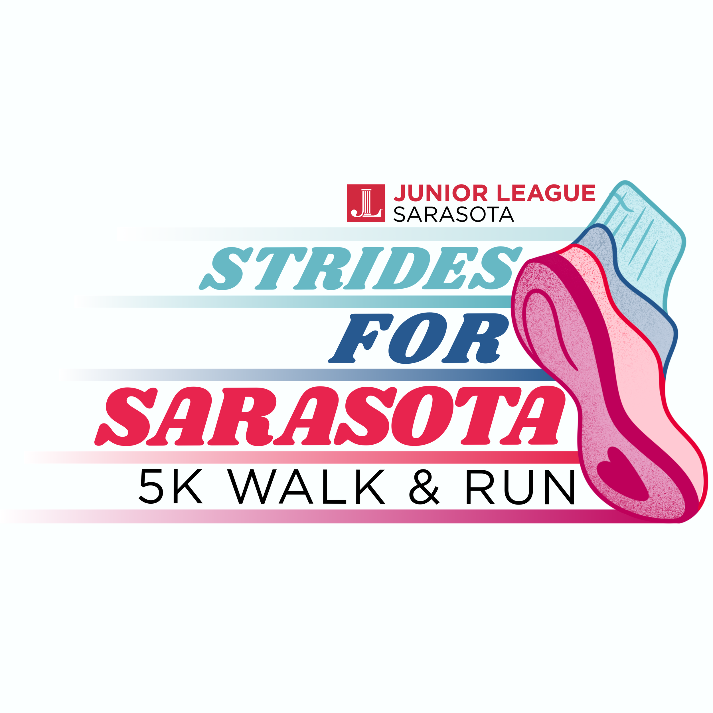
Final logo with final 5k name incorporated